Loading

TARERK wine – branding and label design

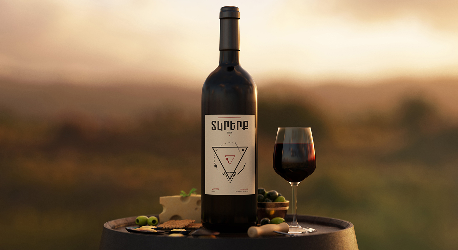
TARERK wine is the epitome of Silva Atoyan’s personal winemaking style, focusing on the production of red, dry wines of the renowned Areni type. Silva’s journey took her through years of collaboration with various wine brands, however, it was in 2023 that she decided to embark on her winemaking venture, driven by the aspiration to manifest her dream wine and share it with consumers.

The letters A and E of the name TARERK are cut so that they form the sides of an inverted triangle. The inverted triangle symbol has various messages in it, but here it represents the ideas of woman, nature, and PASSION.

Check the project on our Behance

Recent Projects

ArmSwissBank’s Annual Report 2023
Branding and identityGraphic Design
ArmSwissBank’s Annual Report 2022
Graphic Design
UNDP՛s footprint in Armenia
Content creationGraphic Design
PARS
Branding and identity
Corizz Dried Fruits
Branding and identity
Inecobank’s Annual Report
Graphic Design
HG Partners
Branding and identity
Influencers Hub Ukraine
Branding and identityGraphic Design
BA HETO? board game
Branding and identityGraphic Design
OVERCOMING POVERTY
Branding and identityCommunications campaignEvent management
QUBIT Education Center
Branding and identity
Humor and Games For Social Good
Branding and identityEvent management