We aimed to create not only a beautiful visual representation of the brand but, more importantly, to create the philosophy behind the visual appearance of the brand. The main promise of the new IT education center is that there will be an atmosphere where almost everyone can learn IT. Besides, the idea was to break the stereotype that technologies are too “scary” and are affordable only for specific people. These ideas are the basis for the brand’s visual identity.
Name of the brand
QUBIT
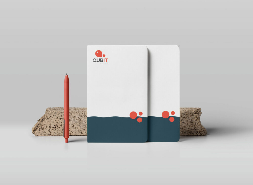
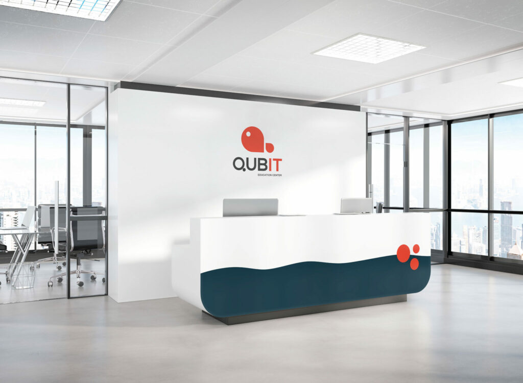
Yes, the word Qubit is the same as Quantum bit, which is the smallest part of data transfer in quantum computers. While Qubit as a brand has been personified with the symbolic image of a fish. It says that everything is not that much complicated and you can also learn IT. In this educational center, we ensure that you will find your place in the job market in the future. Moreover, you will feel like “a fish in water” (Armenian proverb)
The slogan
LEARNING SIMPLIFIED
Usually, all the students are looking for mentors who can explain complicated things more simply. We wanted to let them know that in this education center, they will find them.
LOGOTYPE
The logo consists of the name of the Company and a symbol of fish. It is a “confident fish” swimming into the “deep blue waters of the job market”.
Check the project on our Behance